Project Overview
NCLEX High Yield Website Redesign
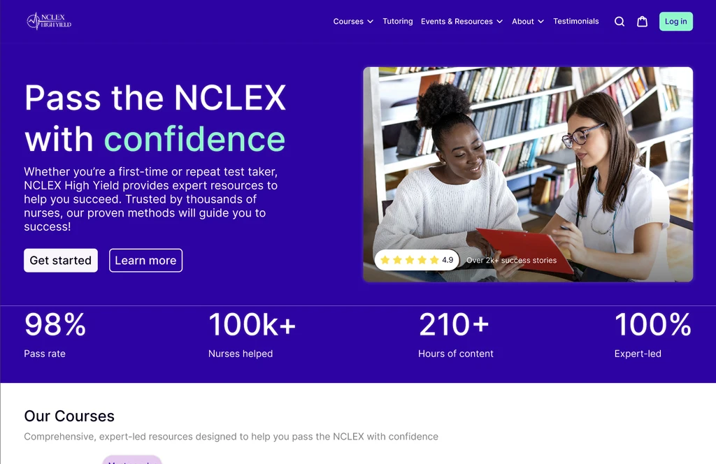
NCLEX High Yield’s program fosters a sense of community for students as well as providing them with proven methods to prepare for their journeys into healthcare. The program offers a platform for student for prepare for their NCLEX nursing exam, a necessary certification in becoming a practicing nurse.
Role
UX/UI Design
Timeline
3 weeks
Team
Me
Courtney Estes
Laura Tornos
Tools
Figma
Figjam
Google Workspace
Context
Lives of Nursing Students
For those unfamiliar, the NCLEX exam is a necessary test for nurses that they have to take in order to receive their credentials.
NCLEX High Yield's platform offers an assortment of study materials backed by trained professionals so students can be well prepared for this grueling exam.

Research
Informed Design
Over the course of the 3 week sprint, we took an informed approach to my design based on:
5 user interviews
4 usability tests
1 screener survey
Heuristic analysis
SWOT analysis
Competitive Audit
Problem Area
Odd Graphics
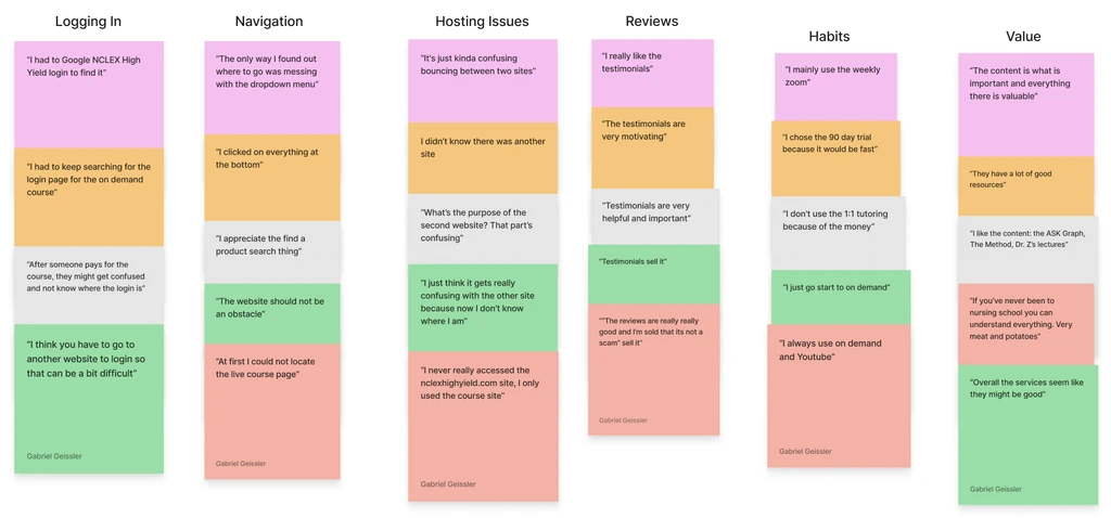
Despite NCLEX High Yield’s ability to connect with their students, many reported that the site was difficult to use and that crucial features such as course material were often buried in pages.
A driving source of pain points on our assessment of the site was that they were operating on 2 separate hosting services (Teachable and Shopify) which impeded visual consistency due to their build in themes.
1.
Buried Features
A common pain point among users was that features (specifically the login) was difficult to find.
2.
Poor Visual Hierarchy
One cause for confusion among users was that there was no sense of hierarchy on the site, so frequently used features were mixed in with rarely used ones.
3.
Confusing Terminology
Users stressed that certain terms were either unprofessional or could be difficult for non-native English speakers.
Problem Area
The Two Sites
Speaking directly to users and seeing how they interacted and thought about the old site, raised some serious pain points that I incorporated into my redesign.
A key insight was that the old site was hosted on two separate APIs (Teachable and Thinkific) whose themes poorly integrated with each other, reducing visual cohesion.
1.
Buried Features
A common pain point among users was that features (specifically the login) was difficult to find.
2.
Poor Visual Hierarchy
One cause for confusion among users was that there was no sense of hierarchy on the site, so frequently used features were mixed in with rarely used ones.
3.
Confusing Terminology
Users stressed that certain terms were either unprofessional or could be difficult for non-native English speakers.
Problem
Here's An Idea Of What The Old Site Looked Like:


No text hierarchy
What does "Live Online" mean?
Unclear interactivity
Unused chatbot
Zero explanation on product
Strategy
Action Plan
1.
High Fidelity Prototype
2.
Comprehensive Design System
3.
35-page UX Content Design Standards
To solve the problems that users faced on the site, we outlined 3 main deliverables:
Solution
Improving IA and Readibility

1.
Easy Access Login Button
One key issue with the old site was that users found the login button difficult to find. This was mainly because the site operated on 2 separate APIs (Teachable and Shopify), so visual consistency was affected by their themes.
We made the button fully accessible through all pages as well as highly visible aligning with branding guidelines in our UX Content Standards.
Stats advertise service
Highly Visible Login
2.
Comprehensive Terminology
Interview participants expressed that certain terms were hard to comprehend for non-native English speakers. Our screener survey showed that non-native speakers were the bulk of their user group, which made this a critical problem.
Drawing from our Content Design Standards, our design conveys services in a concise and inclusive way to boost language accessibility.

Product clarity
Tone for differentiation
WCAG 2.2
Consistent product names
3.
Fluid Navigation
Buried information was a prominent pain point that users faced. Participants in the sample group unanimously expressed frustrations in getting to their course materials page.
By creating a fully centralized navigation bar, we designed for users to spend less time digging and more time learning.
View Products on Dropdown

Increased Error Prevention
Titles signal page status
4.
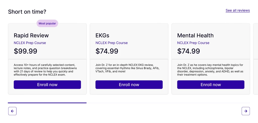
Better API Integration
Due to the 2 sites that the service was being hosted on, thematic differences led to different color, card sizes, and font sizes page to page. This caused users to get disoriented during navigation.
To improve this, we designed our cards to be modular in alignment with the Shopify theme. In our design system, we set sizing and color palette for consistent branding.

Established color variables

Color actionability
Price fully visible
Modular design


Design Process
Research to Iteration


User Interviews and Usability Tests
Speaking Directly to Users
Over the course of 5 interviews, 5 usability tests, and 1 screener survey, we were able to zero in on the issues that students faced when interacting with the old site.
Everyone appreciated the program, most even identified a personal connection between the teachers as well as a sense of community.
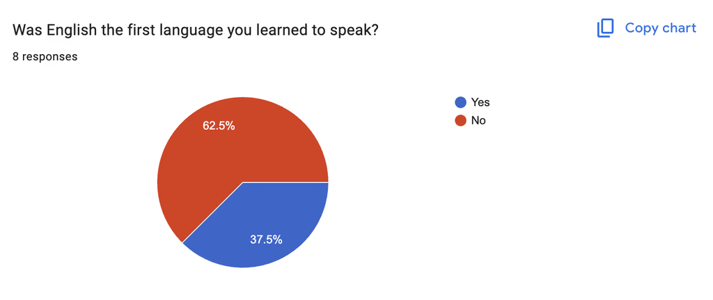
63%
Did Not Speak English As A First Language
The majority of participants in the screener survey identified as being non-native English speakers.
63%
Used The Program On A Daily Basis
Most of participants expressed that they used the website as a daily study practice.
63%
Rate Navigation As A <2 out of 5
Despite working it into their daily routine, users ranked low in satisfaction for site navigation.


Site Audit
Personability Is King
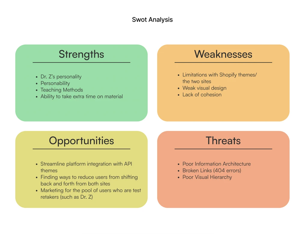
We conducted a full site audit, mapping out the old information architecture, with a Nielson & Norman group model heuristic analysis, and a SWOT analysis.
People loved Dr. Z and his team, however the old site's model posed serious issues with how students would bounce back and forth between the two sites and struggle finding necessary features.

Learnings
Constant Growth
At the end of the 3 week sprint, provided all 3 deliverables to the NCLEX High Yield team. We achieved 100% stakeholder satisfaction upon the final deliverables, and we outlined next steps on the integration of our design.
Of course, improvement is constant and learnings are many, so further usability tests would have been good to gage interactivity with the design.