
Project Overview
Solo Soccer Website Redesign
Solo Soccer Shop is a small soccer equipment store located in South San Francisco. They have historically been a hub for all the youth soccer clubs as the go-to soccer shop outpacing larger name brand stores in the area. Its simultaneously a one stop shop for all your soccer needs as well as acting a community meeting place for regulars.
Role
UX/UI Design
Timeline
3 weeks
Team
Me
Tools
Figma
Figjam
Google Workspace
Context
The Go-To Shop
As the sole UX designer, I was oversaw a 0 to 1 process in the design of a website interface addressing pain points that users faced when interacting with the old website.

Research
Informed Design
Over the course of the 3 week sprint, I took an informed approach to my design based on:
5 user interviews
4 usability tests
3 open cart sorts
SWOT analysis
Competitive Audit
Problem Area
Odd Graphics
Speaking directly to users and seeing how they interacted and thought about the old site, raised some serious pain points that I incorporated into my redesign.
1.
Irrelevant Imagery
All participants in the the user interviews were confused whether the graphics had anything to do with the product.
2.
No Consistent Branding
Titles were dry and vague with little attention given to setting a general tone. Users found the typography lacking of character and clarity.
3.
Poor Information Architecture
Users were confronted with little information regarding what the store offered, with large portions of pages simply being blank space.
Problem
Here's An Idea Of What The Old Site Looked Like:


What's with the sunset?
Lack of tone of voice or any branding
No Visual Hierarchy
Poor image quality
Difficult readability
Strategy
Action Plan
✅
Increase trust in the site
✅
Streamline the checkout process
✅
Establish brand identity
Based on pain points from usability tests as well as users' anecdotal shopping habits, I outlined 3 main areas to focus on for this project:
Solution
A Full Redesign And Rebrand

1.
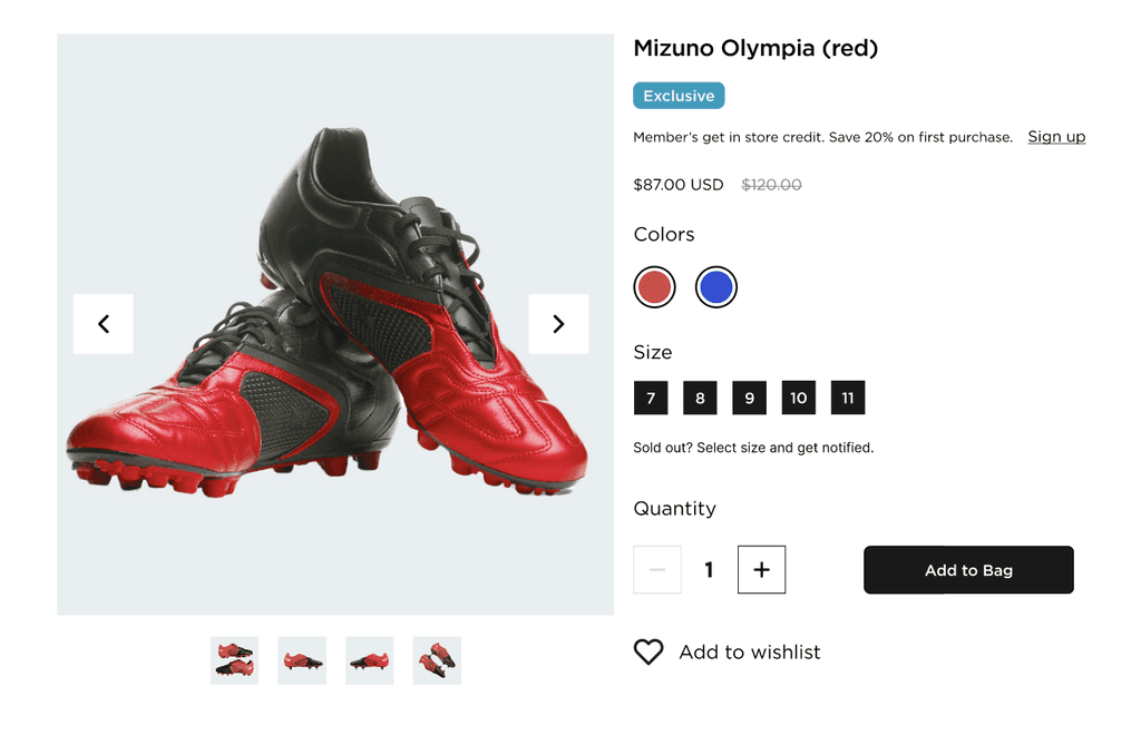
Give Them What They Want
All users expressed that the "main draw" to going to soccer stores as the cleats.
I put the cleats front and center as well as highly accessible upon a first visit. Users could now search and filter for the specific article they are looking for.

Keywords help with error prevention
Quickly alter search with sidebar
Product always in view
2.
Color Themes + Vocab
Users felt the old site pages to be bland and lacking of any established tone.
Through creating a consistent layout with WCAG 2.2 approved font sizes and SEO optimized headings, I was able to make the experience much more engaging.
Relevant visuals
Purposeful use of color
Playful, conversational tone

Legible, clear product titles
3.
Centralized Navigation
One of the main difficulties that users had on the site was confusing information architecture.
By making all page accessible by the header and the footer bars, users can now easily navigate to their desired location with means of error prevention.

All Products on Dropdown
Easy Access PDPs
Full Sitemap Footer
Sign up and social links on all pages

4.
Trustworthy Checkout
Participants in the sample group all agreed that they did not be comfortable inputting their card information on the old site.
I combined industry standard e-commerce checkout systems for a "no fluff" checkout that symbolized the seriousness of the transaciton.


Indication of choice
Saved information for next purchase

Standard Summary Layout

Design Process
Research to Iteration

User Interviews and Usability Tests
No Mall Shoppers
All participants showed frustration with navigation and found that "nothing made sense" and lacked trust in the old website.
Users felt like they were opting more for online convenience over an authentic experience in person.

75%
Were Informed By A Prior Purchase
The majority of users expressed only buying online if they had bought an item or been to a specific store before.
75%
Looked For A Specific Article
Almost all members of the sample group stated that they were "not browsers", having a specific cleat in mind when purchasing.
100%
Prioritized Selection
All users strictly focused on selection as a key marker of satisfaction when buying online, however not in person.
Search Feature
Most participants expressed using the search function most regularly.
Reviews
The sample group stated that although they would not post reviews, it was useful for gaging size reliability.
Autocomplete
Users were more inclined to like autocomplete if it sped up checkout the second time around.
Custom Jersey
Jerseys showed low priority among the sample group but most would say that "it would be good to have".
Competitor Audit
In The Presence of Giants
A high marker of user satisfaction was the speed of the checkout process: convenience online came with the perks of being a speedy process.
In my competitor audit, I looked at shoe centric brands to graft some of their solutions and shortcomings.

Restructured IA
Accessibility Roadmap
I remodeled the information architecture of the site, based on key markers such as selection and convenience.
Markers such as findability, error prevention, and speed were always in mind.


Improved Header Bar:
✅
Easily Access Products
✅
Easily Search Products
✅
Easily Conveys What Information Is Available
✅
Conveys System Status While In Purchase
Improved Footer Bar:
✅
Fully Accessible Sitemap
✅
Legible and Communicates Services
✅
Conveys Full Scope of Website
User Persona
Trevor: A Man After the Perfect Boot
Given the data, our average user would be repeat customer. Considering that Solo Soccer already has a sizable clientele, bringing them online would be giving them a convenient option seeing that the location might be far from where they live.

Learnings
Constant Growth
At the end of 3 weeks, I achieved 100% stakeholder satisfaction in the final deliverable. However there are always more that can be learned and improved upon.
One case that I could have optimized the site more for was to drive foot traffic into the physical store rather than solely being an e-commerce platform. Further usability tests and research would be needed to gage performance of the site in addition to the physical location.